PROJECT BRIEF
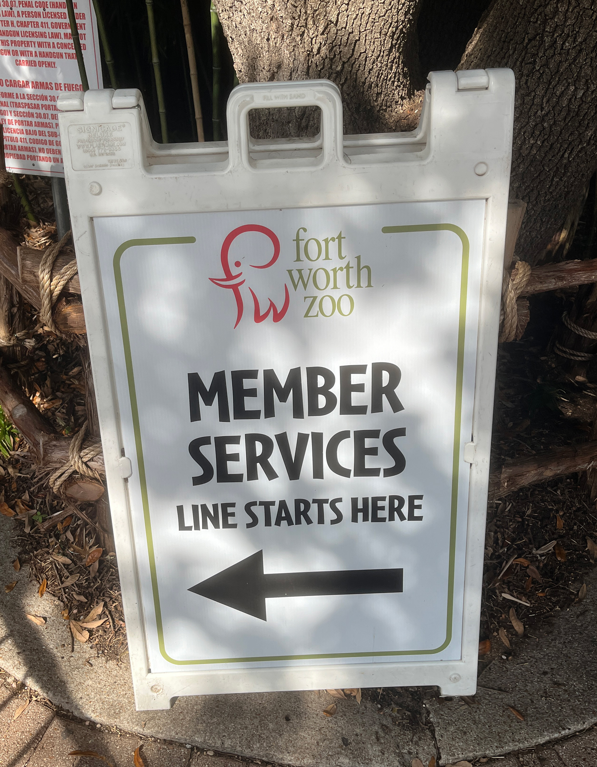
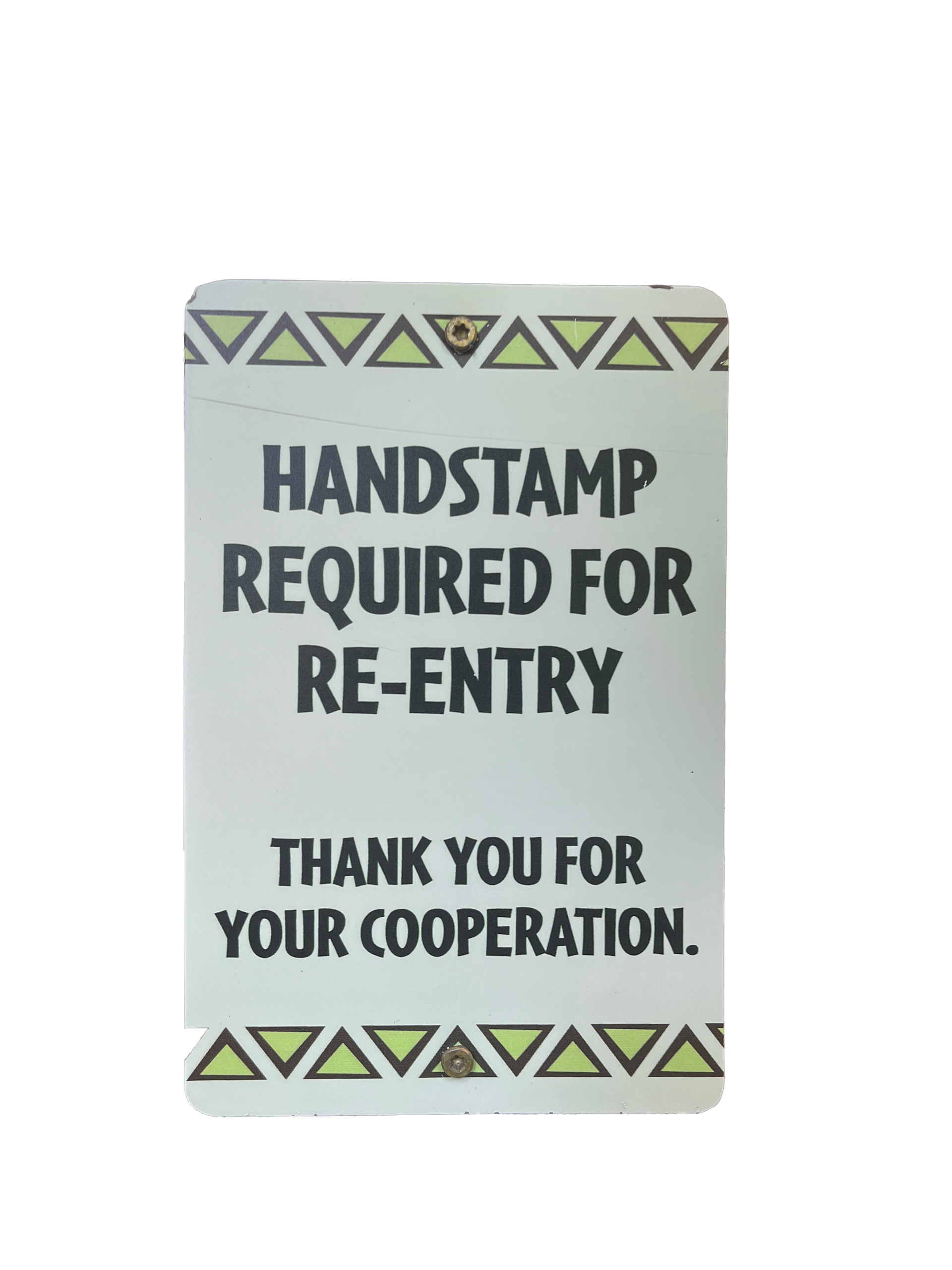
The zoo needed to replace an outdated signage system that no longer matched its ongoing modernization. Wayfinding and operational signs felt inconsistent and unclear, so the goal was to create a system that is easy to read, simple to navigate, and visually aligned with the current direction of the zoo.
SOLUTION
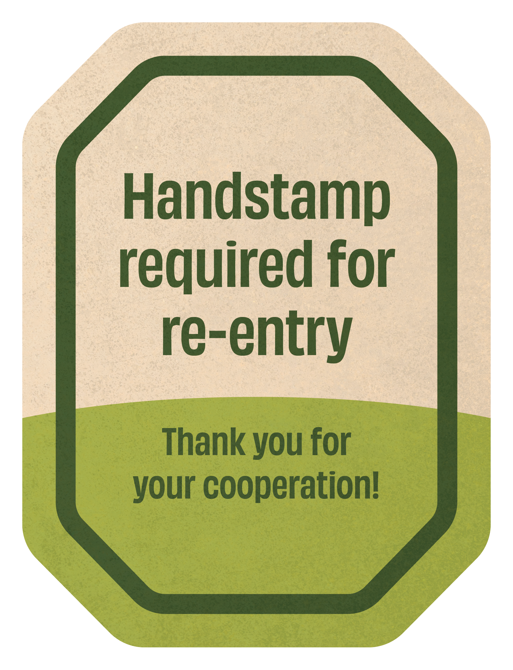
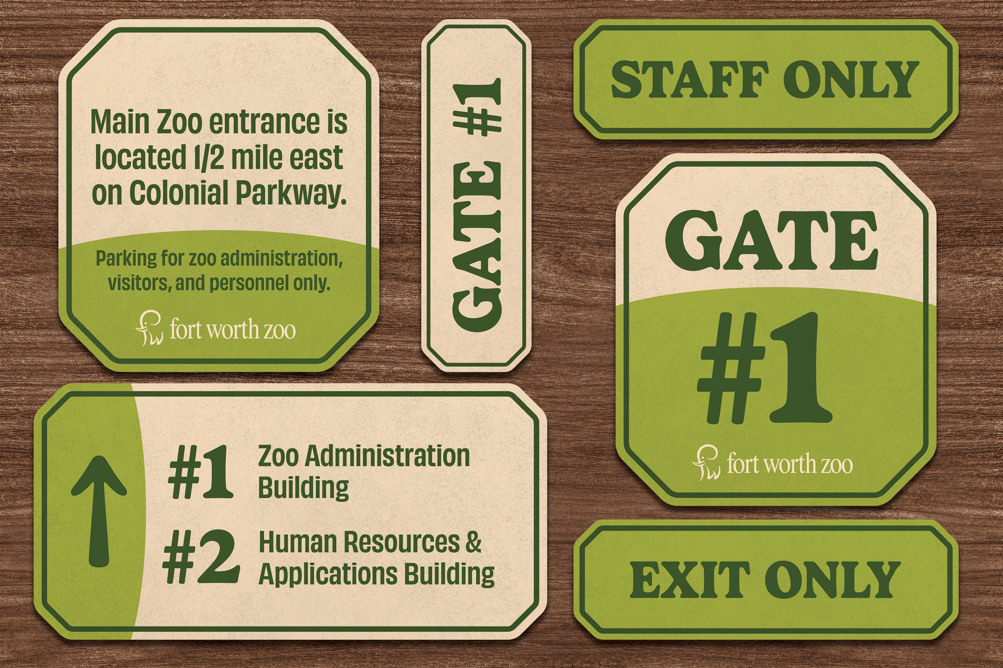
We created a modular signage system built around a consistent shape, a green led color palette, and clear, legible typography. The layout improves hierarchy and makes information easier to scan, while still feeling warm and approachable. The system works across everything from directional signs to staff areas, keeping the experience consistent across the entire campus.
This was developed as a collaborative effort with the in house design team from concept through final production.
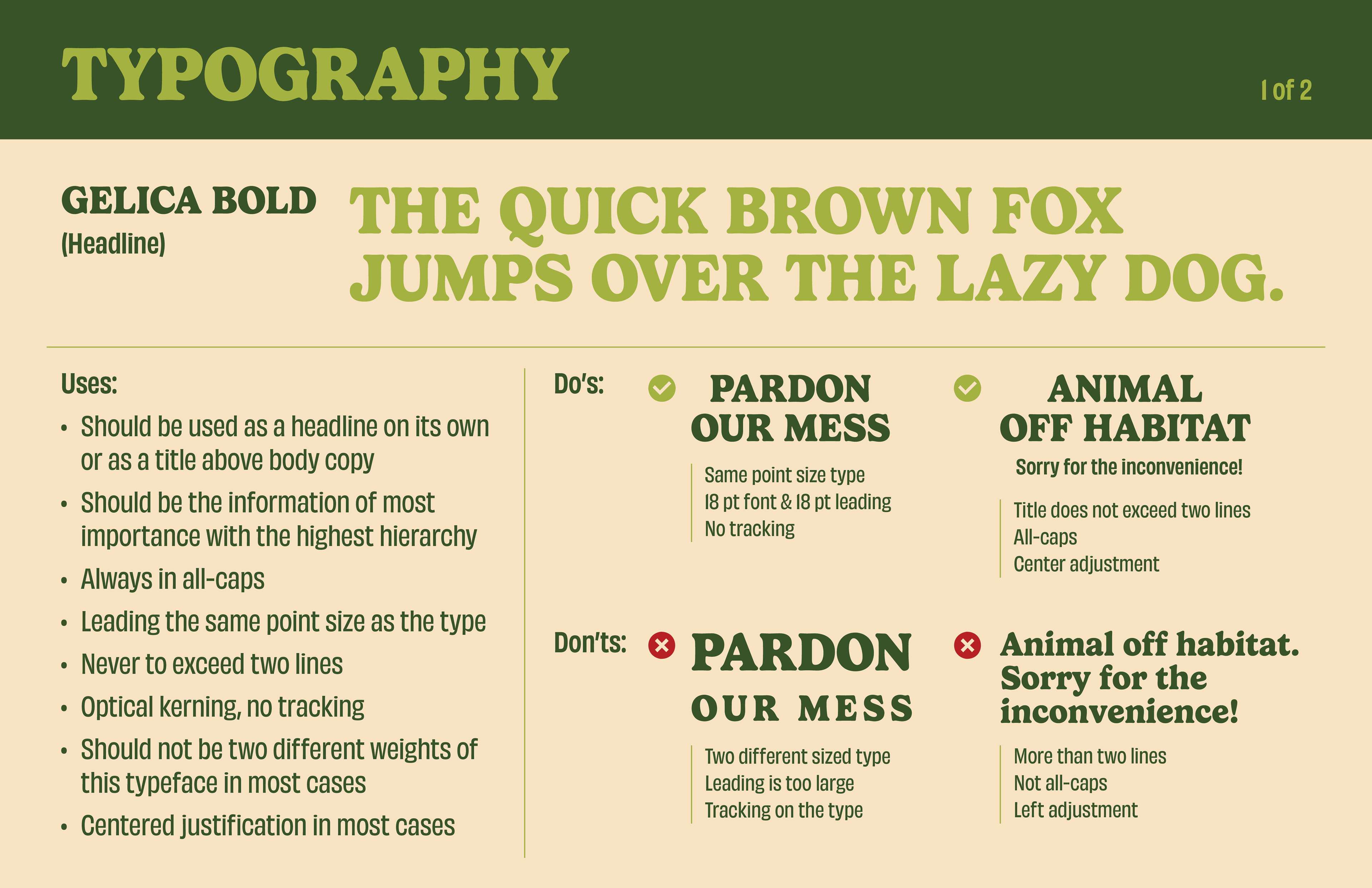
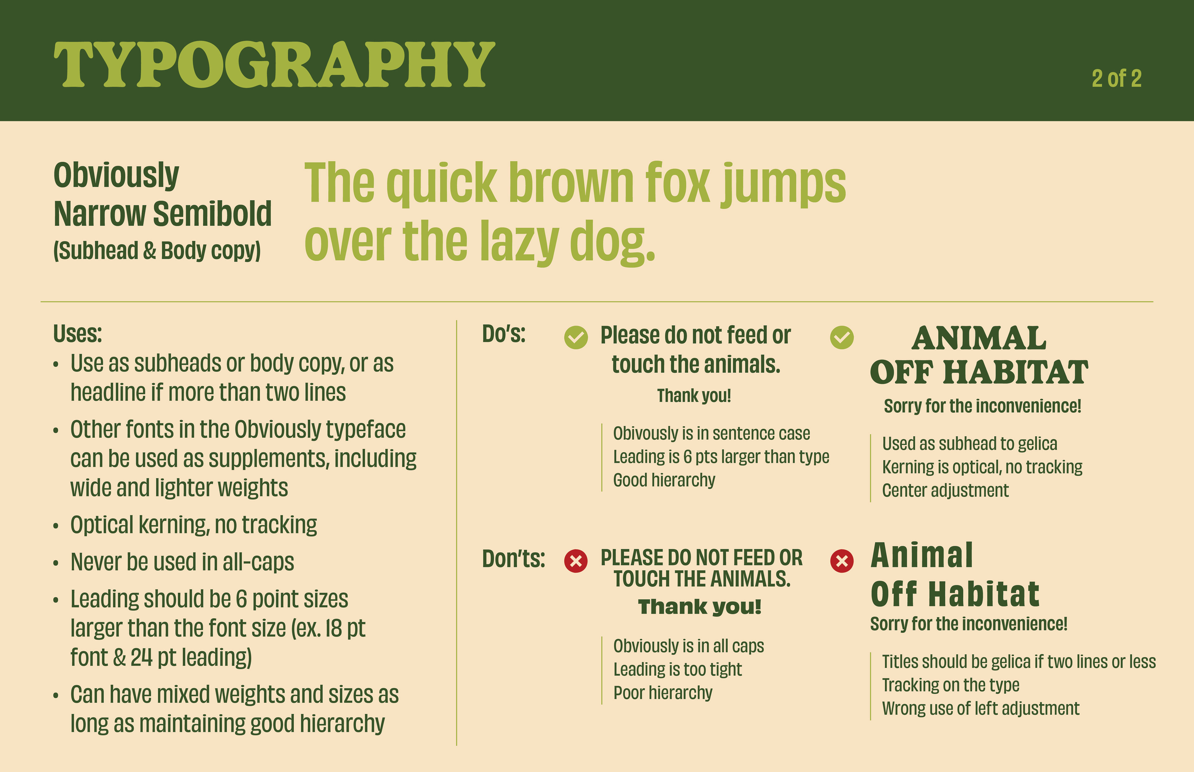
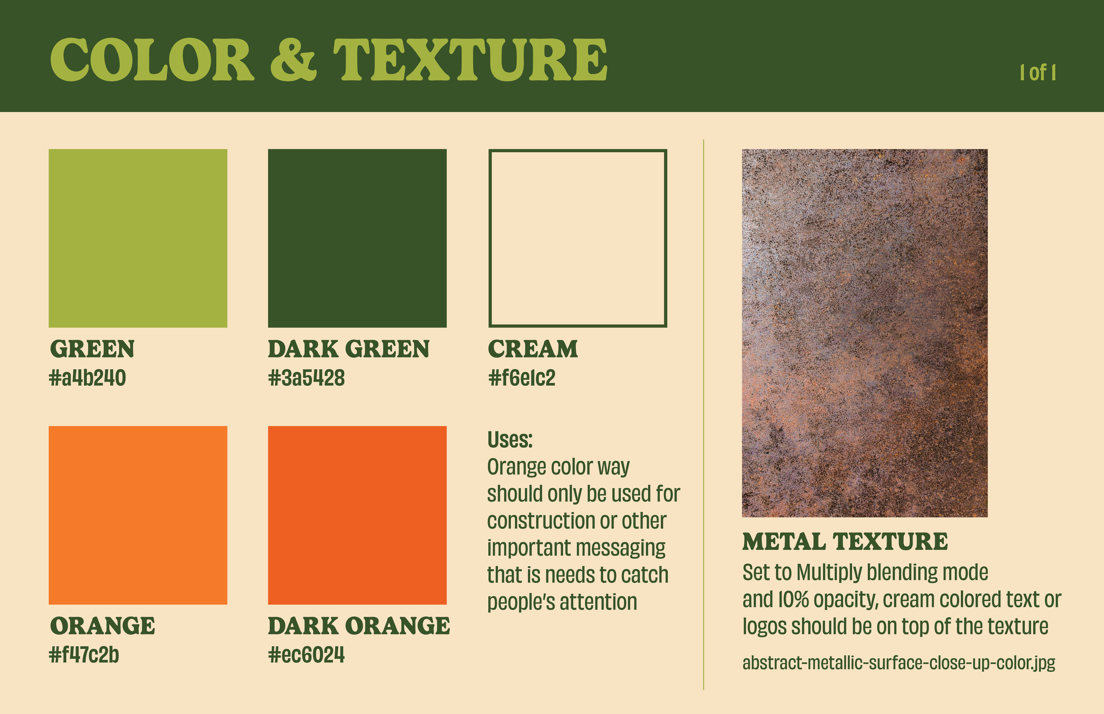
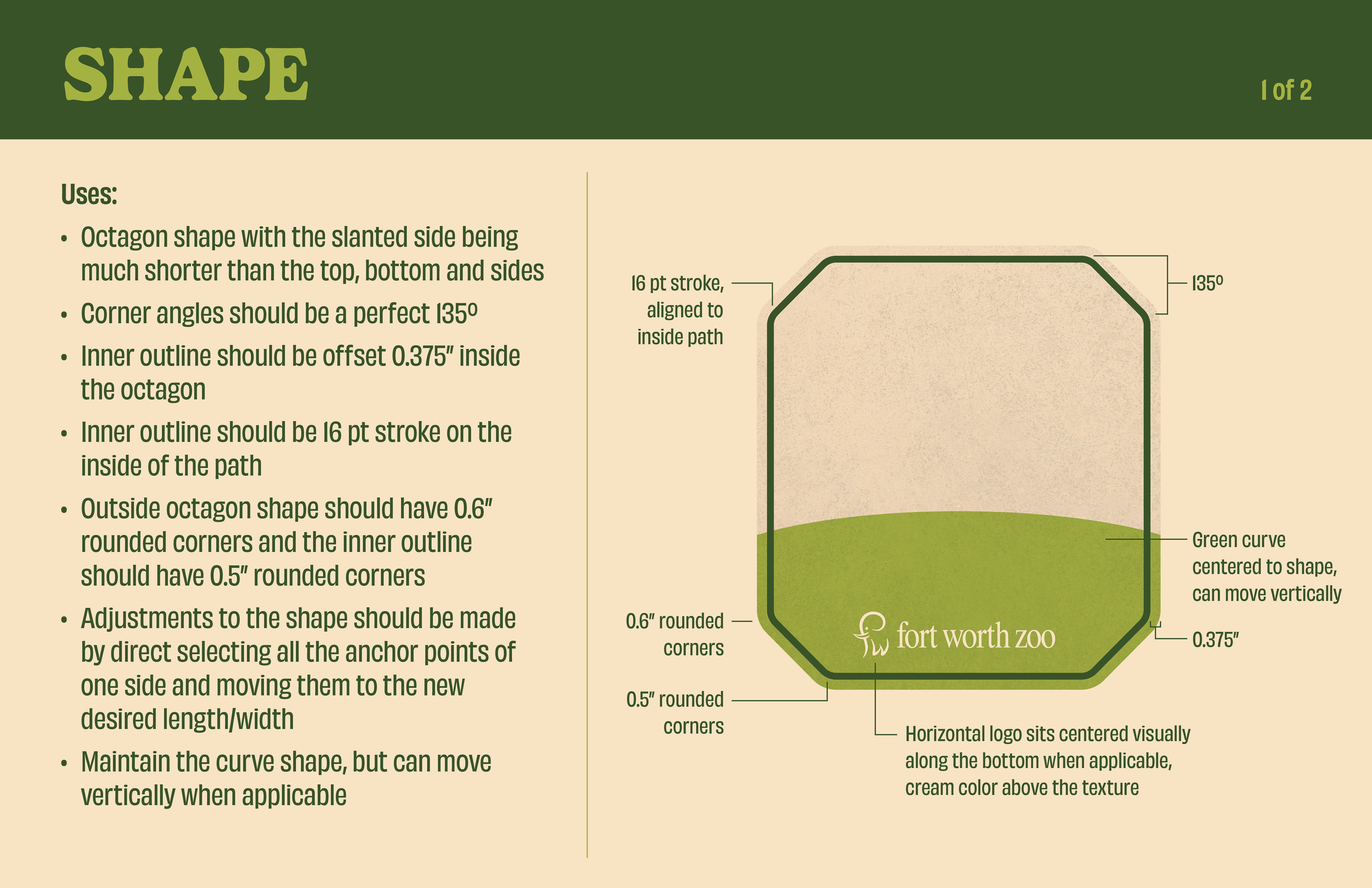
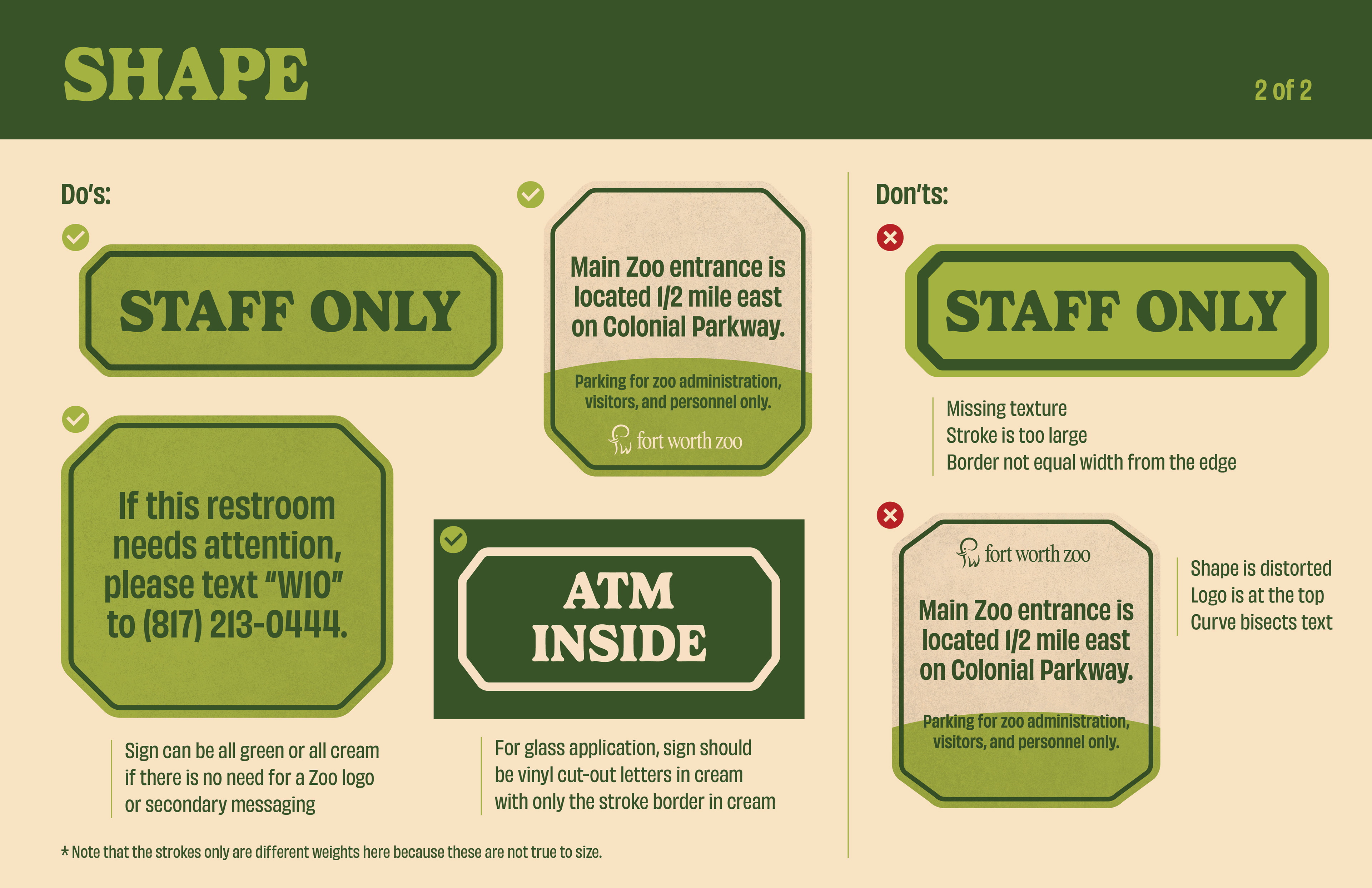
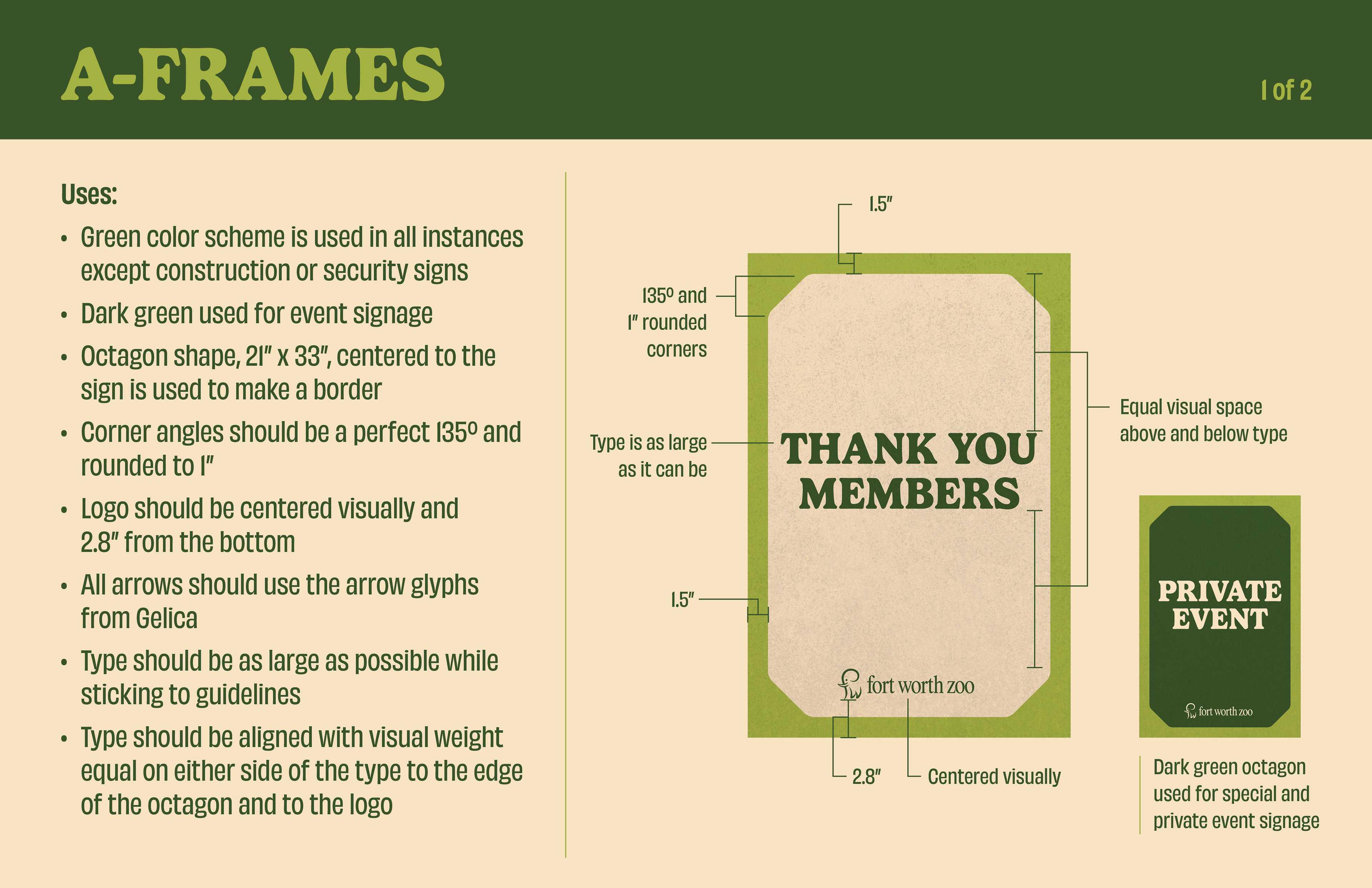
Branding Guidelines
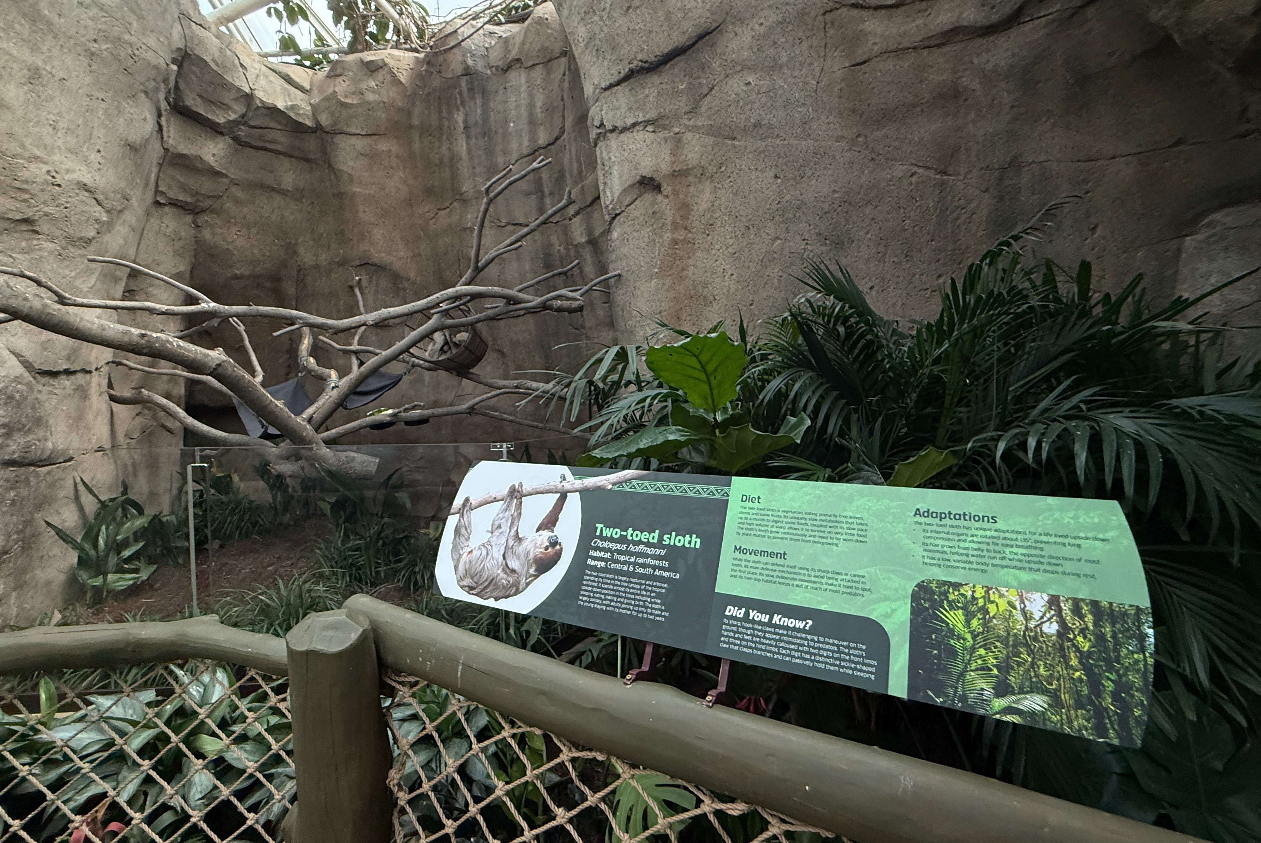
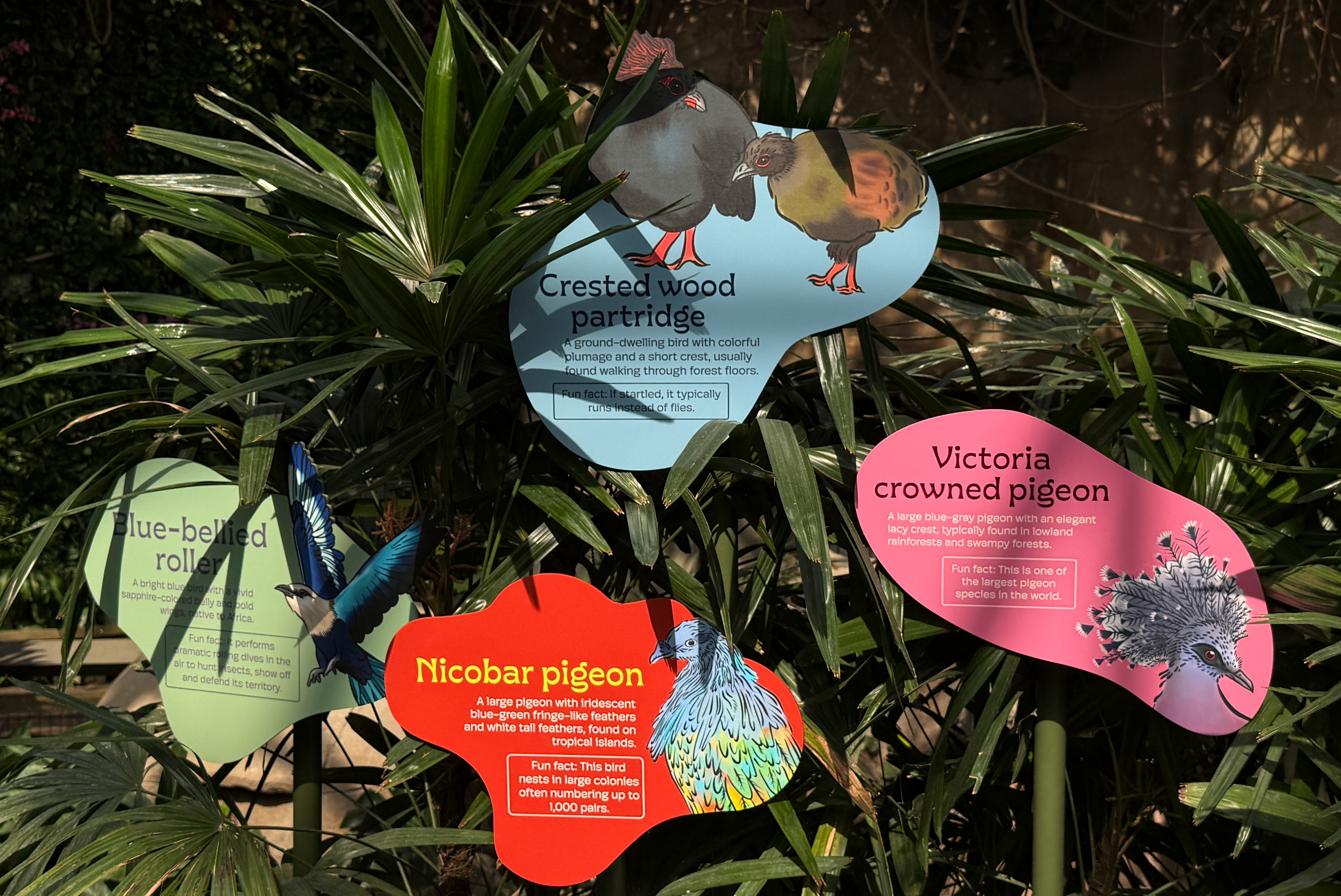
Before and After Branding Mockup